Apple Health
Product
Apple Health app
Skills
User Research
Information Architecture
User Experience Design
User Testing
Prototyping
My Role
UX Designer
Timeline
Jun 2025 - Aug 2025
Collaborators
Difei Huang, Rachana Rachaprolu, Qingyuan Qiao, Randeep Satish, Weiwei Tang

Background & Problem
Checking Apple Health and not knowing where to start.
Imagine opening Apple Health looking for clarity, but instead being met with dense information, complex metrics, and an experience that feels hard to scan at a glance.
Apple Health is powerful, but when health data takes too much effort to interpret, people are less likely to stay engaged. I explored how the experience could feel clearer, more approachable, and easier to act on.

Research
How do people use Apple Health?
People use Apple Health to track basics like steps, sleep, heart rate, and medications.
Some let it run in the background, while others connect apps like MyFitnessPal or Strava for a fuller picture.

Finding the RIGHT problem.
To understand where Apple Health was breaking down, I looked at both what people said and what they actually did.
Observations
Data Points
What our participants said…
Their feedback showed that the challenge wasn’t a lack of features, but an experience that often made important actions feel harder to find, understand, and trust.

Participant 03
"Sometimes I just want a quick answer, not all this information".

Participant 05
"I thought my phone would track sleep automatically".

Participant 06
"I don't know what I'm sharing or with who".
Key metrics from testing.
Primary research showed that task completion, SUS, and NPS all fell below average.
60%
Task Completion Rate
44
System Usability Scale (SUS)
-25
Net Promoter Score (NPS)
Insights & Opportunities
Key insights from our users.
Users felt overwhelmed by the amount of information, struggled to find key features, and lacked confidence in understanding and sharing their health data.
Motivation
Users do not have the motivation to record data due to confusing user journey.
Prioritization
Users feel overwhelmed by the interface. Don’t know where to start or what is relevant.
Accessibility
Key features are hard to find, making health tasks hard to complete.
Privacy
Unclear sharing boundaries reduce trust and prevent feature adoption.
Data Visualization
Charts feel overwhelming and don’t translate data into meaning.
Visual Elements
Icons and UI labels don’t match user expectations, causing hesitation.
Turning these insights into opportunities.
From these findings, I identified three design opportunities that could make everyday interactions feel clearer and more intuitive.
Too much at once
With so much information shown at once, users needed clearer hierarchy to quickly understand what mattered most.
Repeated tasks felt slow
Frequent actions like logging health data took more effort than they should, making everyday use feel less seamless.
Sharing felt unclear
Users needed a more transparent sharing flow so they could feel confident about what was being shared and with whom.
Feature Definition
A more personalized summary.
I contributed to the design of a more personalized summary experience that helps users better prioritize the health information most relevant to them.
Faster logging with widgets.
I contributed to the design of flexible widgets that make common health actions quicker and easier to access.


Health Highlights


Water Intake


Cycle Tracking


Medication Reminder
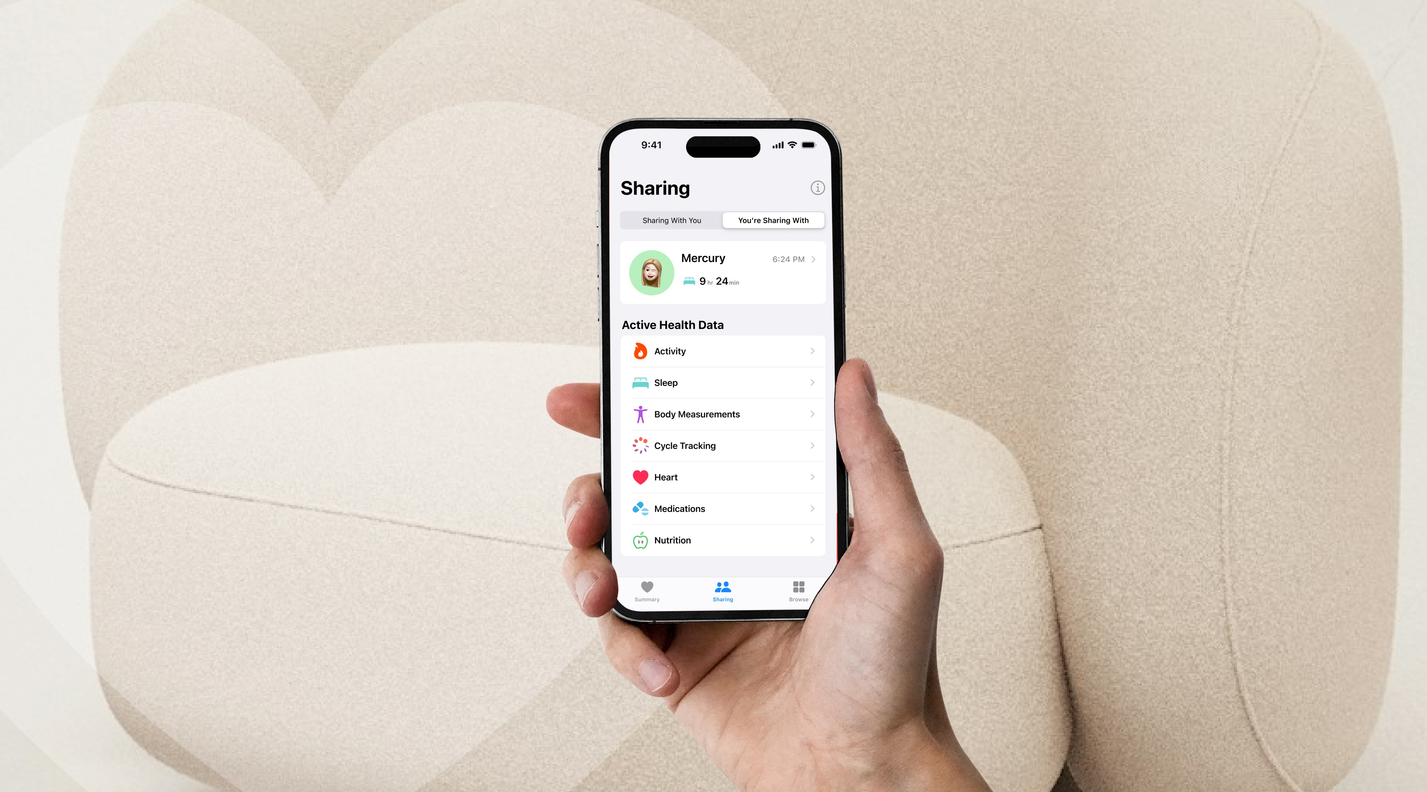
Clearer sharing flow.
I focused on redesigning the sharing experience to make it feel clearer, more transparent, and easier for users to trust.


Future Impact
How will this impact the future?
This redesign helps Apple Health feel less overwhelming and more supportive in everyday life. By making important information easier to see and understand, it can help people build a stronger connection with their health over time instead of ignoring the app altogether.
